



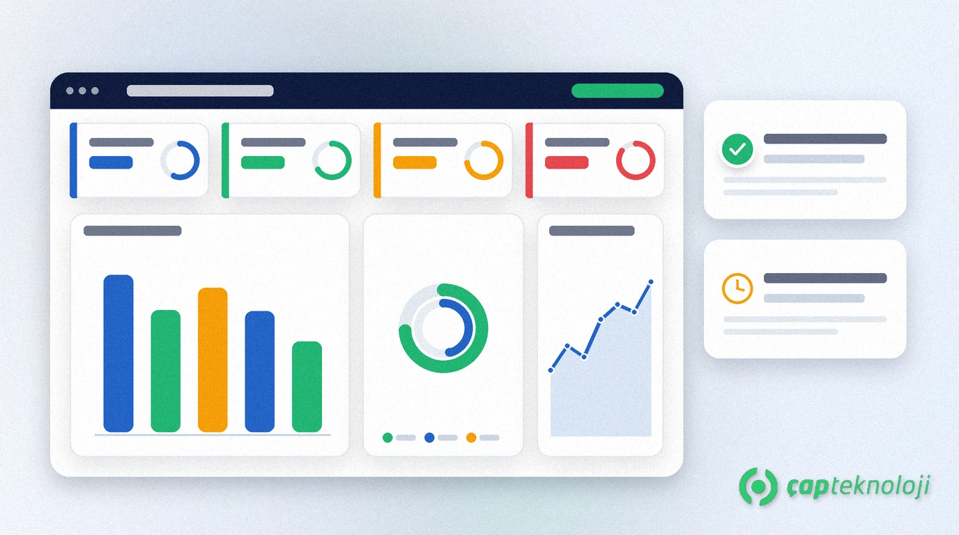
In short: An effective power bi dashboard for smes brings sales and operations KPIs onto one screen so decisions move faster. Instead of weekly spreadsheet packs, you get filtered, role-aware visuals that show which product, region or process is missing the target.
In many SMEs, reporting still means emailed workbooks and hand-merged tables. That approach is late by design and lets each department invent its own “truth”. Within business intelligence consulting, Power BI pulls ERP and operational data into a shared model so management, sales and operations look at the same numbers.
This guide shows how to build a Power BI dashboard for SME sales and operations KPIs, which metrics earn a place on the canvas, and which mistakes to avoid. For a broader KPI shortlist see our article on which KPIs to track in ERP data analysis and reporting; here the focus is the practical Power BI screen.
What Is a Power BI Dashboard for SMEs?
A Power BI dashboard is an interactive summary surface that pins visuals from one or more reports. Its job is not to answer every ad-hoc question with a giant pivot table; it is to answer “what changed, where is the gap, whom should we call?” in daily and weekly management.
Microsoft documents the distinction between reports (deeper analysis) and dashboards (at-a-glance KPIs). See Microsoft Learn — Power BI dashboards for the official overview.
For SMEs the value clusters in three places: (1) sales performance and stock/shipment reality on one panel, (2) managers checking status from a browser or phone, (3) meetings that stop debating files and start listing actions.
How to Choose Sales and Operations KPIs
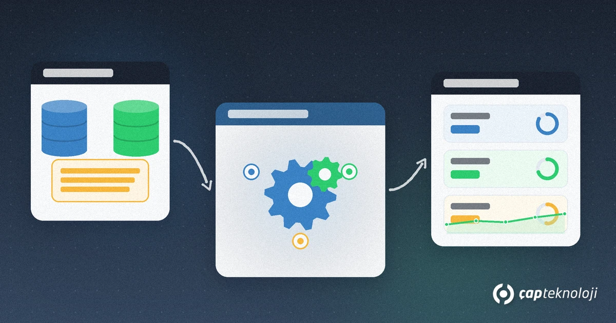
A good Power BI dashboard for SMEs does not display every metric; it starts with the few KPIs decision roles actually watch.
1. Sales core metrics
Period revenue versus target, order count, average order value, new versus existing customers, and target attainment by region or rep. These answer “how much did we sell?”; product and customer slices explain why.
2. Operations core metrics
On-time delivery rate, age of open orders, SKUs below safety stock, return rate, and warehouse or production delay where relevant. Operations KPIs show whether sales promises were kept; revenue alone misleads.
3. Bridge metrics
Days of inventory, campaign impact and cancel/revise rates connect sales and operations into one story. Later you can attach natural-language questions with LLM and RAG patterns, but the measurable KPI layer must come first.
Steps to Build the Power BI Dashboard
1. Name sources and owners
Which ERP, CRM, commerce or Excel extracts? Every source needs a business owner and a refresh cadence. Ownerless data becomes ownerless KPIs.
2. Build a clean model
Relate fact tables (orders, shipments) to dimensions (customer, product, date, region). Keep calculations in measures; avoid formula piles inside each visual.
3. Design role-based pages
Executive summary, sales detail and operations queue should not share one overcrowded “everyone sees everything” page. Row-level security (RLS) is a common way to let reps see only their territory.
4. Wire refresh and quality checks
A dashboard is only as good as its last refresh. Gateways, scheduled refresh, failure alerts and a “last updated” stamp build trust. If Matrix42-style BI integrations or ERP feeds break quietly, panels go stale without anyone noticing.
Common Mistakes
- Cramming everything onto one screen: Thirty visuals are unread; start with 6–10 focused KPIs.
- Undefined metrics: Is “revenue” gross or net, VAT in or out? Without a glossary the dashboard creates arguments.
- Permanent Excel bridges: Fine as a temporary patch; dangerous as the lasting system of record.
- Ignoring mobile layout: Managers and field leads often open the phone first.
Checklist for a Power BI Dashboard for SMEs
- Write the business questions: Which five questions must the panel answer?
- Approve the KPI glossary: Sales and operations should sign the same definitions.
- Finish model and refresh first: Visual polish comes after trustworthy data.
- Pilot with three roles: One executive, one sales user, one operations user for two weeks.
- Review access and RLS: Wrongly shared customer data is both a security and a trust issue.
At ÇAP Teknoloji we help SMEs design Power BI dashboards, data models and KPI glossaries under our business intelligence (BI) consulting service. To simplify your sales and operations panels together, contact us.
To set up your reporting structure step by step, you can also read our article on reporting consulting.
Frequently Asked Questions
What is the difference between a Power BI dashboard and a report?
Reports support deeper page-by-page analysis; dashboards pin critical KPIs from one or more reports for at-a-glance monitoring.
How many KPIs should an SME put on the first dashboard?
Six to ten focused metrics is enough for v1. Every added KPI should answer a written business question.
Should sales and operations KPIs share one panel?
Yes on the executive summary. If revenue is read without on-time delivery and stock risk, promises drift from operational reality.
Can we start a Power BI dashboard from Excel?
Yes as a temporary bridge. The lasting setup connects ERP/CRM sources with a model and scheduled refresh.